7 Event Directional Banner Tips for Global Buyers?
Buying an Event Directional Banner for an international event involves more than choosing a bright color and a low price. Global buyers must consider language, venue layout, viewing distance, material quality, installation, and accessibility. A banner that works beside a quiet European conference hall may disappear inside a crowded Asian exhibition center.
Wayfinding expert David Gibson writes, “Wayfinding is about knowing where you are, knowing where you are going, and knowing how to get there.” His principle applies directly to event signage. An effective Event Directional Banner should answer those questions within seconds. Clear arrows, readable type, strong contrast, and consistent symbols can reduce hesitation near registration desks, elevators, and emergency routes. Short messages work best. So does generous spacing.
This guide shares seven practical tips for global buyers. It covers message planning, multilingual design, fabric and vinyl selection, color contrast, mounting hardware, proof approval, and supplier communication. Experienced buyers should request material samples, print proofs, flame-resistance information, and photographs of finished installations. Requirements vary by venue and country, so local confirmation remains essential.
Some recommendations may seem obvious. They are still missed. A beautiful banner can fail when sunlight washes out the text or an arrow points toward a temporary wall. I have also seen buyers approve digital artwork without checking the viewing distance. That mistake is costly. The goal is not visual perfection. It is confident movement, even when the venue is unfamiliar, busy, and slightly unpredictable.
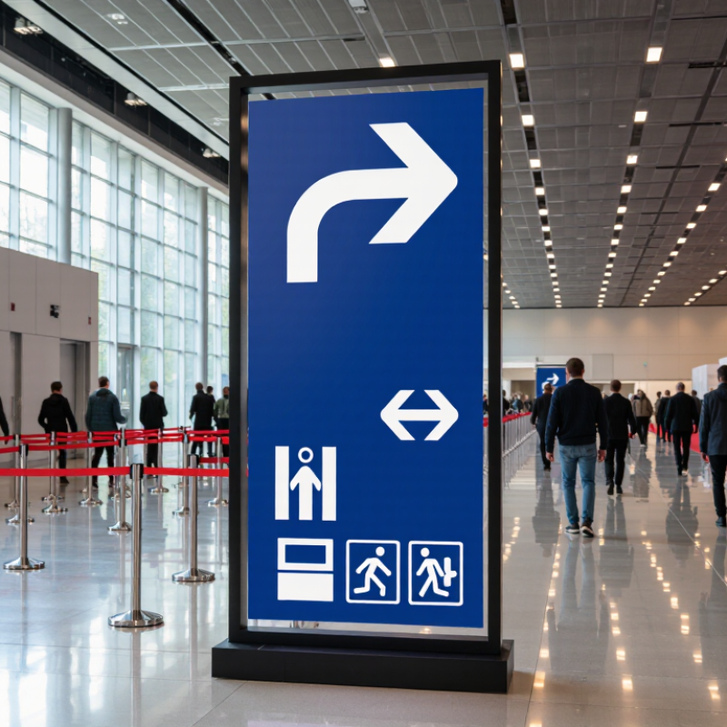
Define the Seven Banner Functions Using ISO 7010 Wayfinding Principles
ISO 7010 standardizes safety-sign symbols; it does not define seven event-banner categories. Its useful wayfinding lessons are consistency, legibility, and familiar symbols. For global buyers, define each banner by one clear visitor task.
The seven functions are arrival, registration, route guidance, destination identification, queue management, facility location, and emergency egress. Arrival banners identify the entrance from a distance. Registration banners point visitors toward check-in. Route banners guide people at turns, while destination banners name rooms or stages. Queue banners show where lines begin. Facility banners locate services such as restrooms or information desks. Emergency egress signs must retain their standardized safety meaning and must not be replaced by decorative event banners.
Keep it clear. Use concise wording, strong contrast, and arrows that match the route visitors can actually take. Where ISO 7010 symbols apply, reproduce them accurately; do not invent look-alike safety symbols. Check sightlines at eye level and from farther away, especially in crowded halls. Test it onsite. A banner that looks obvious on a screen may disappear behind a column, or point toward a closed passage. That small planning gap is easy to miss, and worth checking before installation.
Set Letter Size with the 1-Inch-per-10-Feet Legibility Rule
For global event buyers, the 1-inch-per-10-feet rule is a practical starting point, not a guarantee. If visitors read your banner from 30 feet away, plan on letters about 3 inches high. The Federal Highway Administration’s 11th-edition Manual on Uniform Traffic Control Devices treats viewing distance as a key sign-design factor; its roadway standards are not event-banner rules, but the principle travels well. Measure from the farthest likely approach, not from the booth counter. A busy aisle, glare, or a banner hung above eye level can make readable type feel surprisingly small.
Tips: Stand 30 feet away and read the headline aloud. If you hesitate, enlarge it. Use a short message, strong contrast, and plain letterforms. Keep the key words near the center, where passing visitors can catch them quickly. Check the banner under venue lighting, too; colors that look crisp on a laptop may blur under warm spotlights. A quick test with printed letters taped to a wall is useful, though it is not a substitute for viewing the finished material.
Leave secondary details smaller, but don’t let them compete with the headline. The one-inch rule gives a measurable baseline: 2-inch letters for 20 feet, 4-inch letters for 40 feet. Those are estimates. Viewing angle, font weight, and crowd movement still matter, and I’d rather oversize the main message than trust a perfect calculation.
7 Event Directional Banner Tips for Global Buyers? - Set Letter Size with the 1-Inch-per-10-Feet Legibility Rule | # | Planning Dimension | Practical Guidance | Example or Check |
| 1 | Estimate viewing distance | Measure the approximate distance from the banner to the point where attendees need to read it. Use the longest likely viewing distance for the main message. | A sign read from 40 feet away should use the 40-foot row in the sizing rule. |
| 2 | Set uppercase letter height | As a rule of thumb, allow about 1 inch of uppercase letter height for every 10 feet of viewing distance. This refers to the physical height of the printed letter, not its point size. | 20 ft: 2 in; 30 ft: 3 in; 40 ft: 4 in; 50 ft: 5 in; 60 ft: 6 in. |
| 3 | Keep directional copy brief | Use a clear destination or action, such as “Registration” or “Hall B →.” Short wording is easier to scan while people are walking. | Prefer “Exit →” over a full sentence explaining the route. |
| 4 | Make the arrow unambiguous | Use a large, familiar arrow and place it close to the destination text. Check that its direction matches the actual route from the viewer’s approach. | Test the design from both sides if attendees may approach from either direction. |
| 5 | Use strong contrast | Choose text and background colors that are clearly different in lightness. Avoid placing important text over busy photographs or patterns. | Dark text on a light, plain background—or light text on a dark, plain background—usually improves quick reading. |
| 6 | Allow for placement and viewing conditions | Keep the message at a visible height and out of sightline obstructions. Increase letter size or simplify the message when lighting, crowding, or viewing angles may reduce legibility. | Review the sign from the expected approach path, not only from directly in front of it. |
| 7 | Check language and production details | For international events, use familiar terms, clear symbols, and translations where needed. Confirm the finished banner’s dimensions, orientation, and readable area with the printer. | Proofread translated destination names and verify that the arrow remains clear in the final-size artwork. |
| Note: The 1-inch-per-10-feet guideline is a practical starting point, not a guaranteed standard. Actual legibility depends on typeface, letter shape, contrast, lighting, viewing angle, and the viewer’s vision. |
Design for ADA: Use 5/8-Inch Minimum Tactile Characters
A directional banner can catch attention, but it cannot replace every accessible sign. In the United States, ADA tactile-character rules apply to specific signs, including many signs identifying permanent rooms and spaces. For covered signs, characters must be at least 5/8 inch tall, measured from baseline to top. Check the rules that apply to the sign’s purpose and location before adding tactile text to a temporary event banner.
Tips: Measure the uppercase characters, not the whole line. Keep raised lettering clear of seams, grommets, and curled edges. Use strong visual contrast for the banner, and provide a separate, appropriately placed tactile sign when required. Global buyers should verify local accessibility standards; one specification may not suit every venue.
A practical proof check helps. Compare the approved artwork with a ruler, then inspect a physical sample under ordinary lighting. Small type can look generous on a monitor and cramped on vinyl. A common design miss is prioritizing a long venue name over readable characters. Shorten supporting copy instead. It is not always elegant, but people should not have to guess where an arrow leads.
Choose Materials Rated for 3–5 Years of Outdoor UV Exposure
For global buyers, an event directional banner must survive more than one sunny weekend. Choose a substrate rated for three to five years of outdoor UV exposure. That rating should cover the fabric or film, inks, and finishing components. Ask suppliers for test conditions, not just a number. A credible document names UV intensity, test duration, color-change criteria, and regional assumptions. A banner under harsh coastal sunlight may age faster than one in a shaded European plaza. Real conditions vary.
In practice, solution-dyed polyester often keeps its color better than basic printed cloth, while coated vinyl can provide stronger weather resistance. However, performance depends on ink chemistry, surface coating, stitching, and edge reinforcement. Inspect a sample after bending it, rubbing it, and exposing it to moisture. Check whether the image cracks near folds. Look closely at grommets and pole pockets. Small failures appear there first. Use UV-stable thread and corrosion-resistant hardware for humid locations. Do not accept “outdoor grade” without measurable evidence.
I have seen attractive banners fade before their frames failed. The original specification looked sufficient, but the exposure estimate was too optimistic. That mistake changed my buying process: request a written service-life range and care instructions. Leave room for uncertainty. A three-year rating is not a promise of identical color on every continent. Confirm replacement plans, cleaning limits, and storage conditions before approving a large order. Test one full-size unit when the event schedule allows it. It costs less than replacing a complete wayfinding system during installation.
Verify Global Color Contrast at the WCAG 4.5:1 Standard
7 Event Directional Banner Tips for Global Buyers
Verify Global Color Contrast at the WCAG 4.5:1 Standard
Directional banners must work under sunlight, shade, indoor lighting, and mobile-camera viewing. WCAG 2.2 Success Criterion 1.4.3 recommends a minimum 4.5:1 contrast ratio for normal text. Large text may use 3:1. This is not a decorative preference. It affects wayfinding speed and accessibility.
WebAIM’s 2024 Million report found detectable contrast errors on 79.1% of tested home pages. Event banners can fail for similar reasons, especially with pale text, gradients, or reflective vinyl. From production checks, dark navy lettering on a warm white background often reads better than bright brand colors. Still, printed results can differ from screen previews. Test the actual material.
Tips:
- Measure contrast with a verified digital tool.
- Test normal and large text separately.
- Check colors under direct light.
- Avoid text over photographs.
- Use generous letter spacing.
- Keep arrows visually distinct.
- Ask someone unfamiliar with the venue to find the entrance.
That last test is simple, but easily ignored. I have also trusted attractive mockups that became unclear at a distance. A second review matters.
For global buyers, request color proofs, contrast measurements, and viewing-distance samples before approving production.